
In this post you’ll find out which are those goals, you’ll see different examples of sidebar usage and I’ll also share some thoughts with you. Note that I’m using AdBlock Plus for Firefox to remove those annoying ads, so you won’t see the screenshots with actual sidebars like they’re supposed to look. But that’s not a big deal since advertisements is only one function of sidebar.
Location
Unlike thumbnails, sidebar has only two main locations. And the word side already tells them to you. That would be rightward or leftward the content. The most popular, of course, is the right side placing, because people are reading from left to right. In that way sidebar doesn’t distract you from the content. But there are few (really few) blogs with sidebar in their left. I’m conservative and I can’t accustom to that. It’s harder for me to read the content, because you just can’t ignore that large box every time you jump a row. That’s just my subjective opinion, but I assume that it’s really not a great placing and that’s why people are using right-sided sidebar way more.
Soh Tanaka is using pretty default, nice looking right-sided sidebar, which isn’t bothering when reading content.
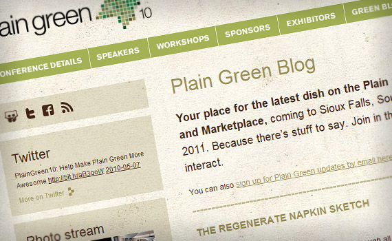
Plain Green, blog about Plain Green Conference, is using light, grungy sidebar in left side. It’s neat and not very distracting, but for me it’s still not comfortable to read text.

Cookie Sounds sidebar is actually kinda connected with footer. This is a photography blog and they’re adding picture descriptions in default sidebar spot. I think that’s excellent solution for this kind of blog, because sidebar doesn’t distract you from the pictures at all.
Background
Sidebar can have it’s own fixed width background or it can lie on default page background. Usually we see the second option, but they’re definitely both equally good. Sometimes, when sidebar lies on page background, there’s a thin separator line between content and sidebar. It makes nice effect, that sidebar actually has its own independent space.
Marked Lines sidebar is laying down on simple white page background. It’s well aligned the feeling that sidebar is independent is achieved.
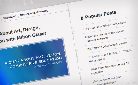
Designer Informer has that thin separator line. Again independent sidebar effect is achieved.
Aljan Scholtens blogs sidebar has it’s own background and it’s also splitted into three parts.
Size
Sidebars size is usually common in all blogs. Their width is about 1/3 – 1/4 of the active area. When sidebar doesn’t have it’s own background, it can be wider. Some blogs has double sidebar where sidebars content goes in two columns. Sidebar is also rarely as long as the content in blog. Usually it’s about 1/2 of the blogs length.

Web Design Ledger is using the double sidebar. They have a lot of content to show, so this is a great solution.
PSD Tuts+ sidebar is pretty wide and it’s about 1/3 of all blogs length.
Objectives
Sidebars has some important functions they’re supposed to do. These functions varies from blog promotion to tag listing. If designed well, sidebar will do these functions very efficient. Here I’ve listed some of the most important ones.
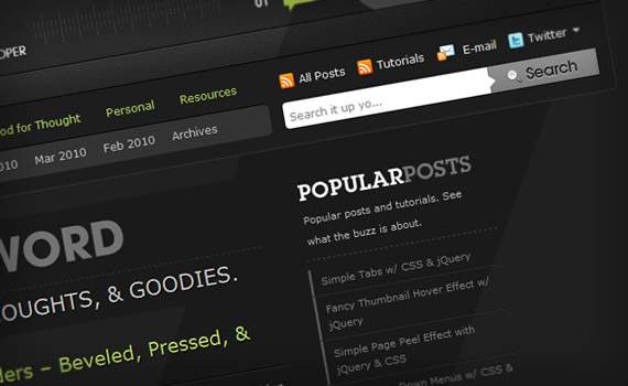
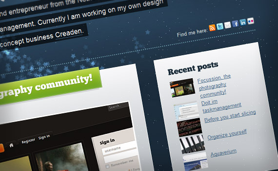
Social Networks & RSS
Most of todays blogs (again especially design related ones) are looking for huge traffic and recognizability. You can sometimes see plenty of social media icons in different locations. The most popular ones are in the header or in sidebar. In sidebar you’ll often find these icons at the top. Why? Simply because it’s the most visible spot. Some blogs also have included Twitter updates in their sidebars.
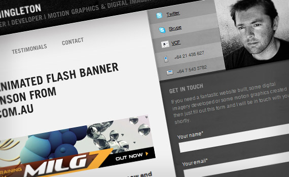
Mark Shingleton’s blog has subscription and Twitter buttons in the header, but he’s also included some important details in the sidebar. You’ll find Twitter updates there too.
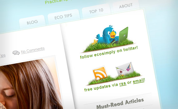
Eco Simply is decorated with 3 great looking icons at the top of sidebar. These icons aren’t annoying and complement blog design nifty.
Search
Another feature which is used mainly in header or sidebar. Search field has to be visible, but at the same time solid and quiet.

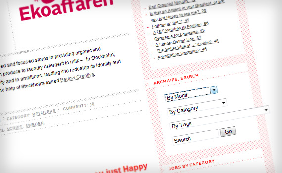
Miasto Fantastyki’s blog has nice dark search box which makes good contrast with the rest of the sidebar. His search box also has a suggestion feature.
Categories
This is simple and self-evident function. Again some blogs has categories menu in header, some in sidebar. That doesn’t change the case though.
Codare has very simple, yet great looking categories menu in sidebar. It’s vivid colors that are customized to match design perfectly.
Specky Boy, blog with sidebar in it’s left, has a solid list of categories in the middle of sidebar.
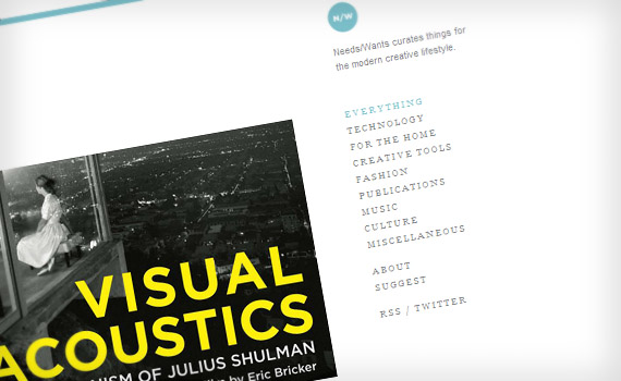
Needs/Wants sidebar is fixed and it isn’t scrolling. That way you can access your wanted category without going back to top of the page.
Archive
People rarely use this function, but that doesn’t mean you shouldn’t include it in your sidebar. Don’t make miles long list with all of the months you’ve been posting since. Include about 5–7 and use View More function if necessary.
In Brand New you can choose the time you’re looking for very rapidly. The same system applies to tags and categories.
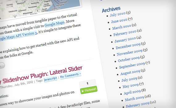
Lateral Code has simple list with months and years. You also get a peek how much posts are in that month.
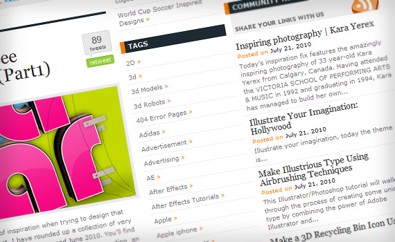
Tags
More used function than archive, but still not quite popular since many blogs tag all their articles almost the same. But this, indeed, can be very usable function which every sidebar should have.
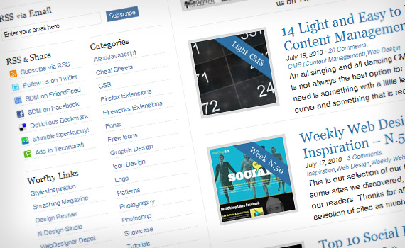
Designrfix has a huge list of tags. I don’t like this solution, because you have to scroll and scroll trough those similar tags to find one you needed. They kinda fix this list with another huge community news list next to this one.
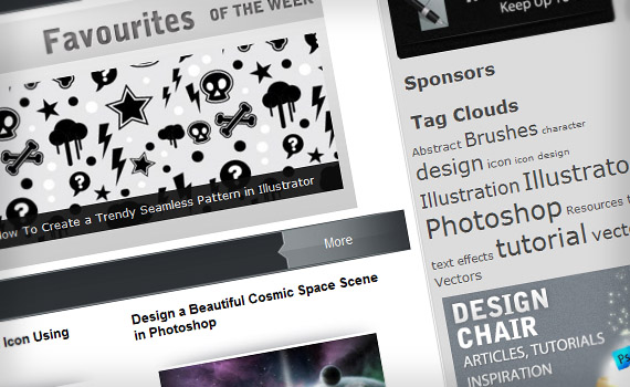
This is what I prefer. Simple tag cloud like in Design Chair.
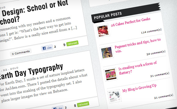
Content
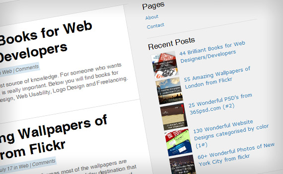
Content is the king. You have to promote your posts and sidebar is a great place to do it. Recent ones, most commented, random – you can include them all. That’s a great way to encourage people to read something else. Don’t overforce and include all posts you ever had in sidebar. Including your most commented or shared posts is a great choice. Promoting not so popular articles ain’t bad either.
Larissa Meek’s blog sidebar contains 4 most popular posts with small thumbnails and comment count. It’s handy, that visitors can also see those details.
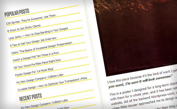
Fringe Focus has put 10 most popular posts in their sidebar. There’s also 5 recent posts just below. Those yellow lines beneath text makes nice composition with the rest of design.
Another option is to promote comments. Some people find them more interesting than post titles.
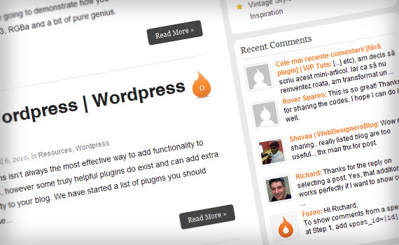
Fuzeo gives visitors the chance to view 5 latest comments. We can also see the commenter names and avatars.
Deziner Folio also offers 5 latest comments. But unlike Fuzeo, there aren’t author names and avatars displayed. If you are seeing just nice or thanks, that looks quite incomplete.
Friends & Partners
Many blogs have their friends – other blogs or sites with similar topics. They’re often included in sidebar or footer. That way your blog visitors can navigate trough sites with similar content. Link exchange with other blogs would increase your traffic.

Fuel Your Creativity has a nice list with their recommended tools. They’re also using good-looking hover technique.
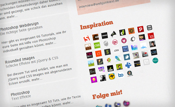
Instead of using text list, Web Junkie XL is using great looking grid of small thumbnails.
Advertisements
Everyone wants to get paid for their work. The best way to earn money with blog, of course, is advertisements. They’re almost unalienable design blog ingredient. Frequently ads fill out almost half of the sidebar. That’s not what visitors want to see, but I don’t dispraise bloggers, because everyone is trying to earn the way he is able to. So I’m turning off AdBlock Plus and presenting you some screenshots.
Ten 125×125 ads together with some larger ones makes Web Designer Depot’s sidebar as long as the content itself. It’s good they compensate it with other good stuff in sidebar.
Other things
Sidebar can contain much more than I listed above. It’s your free choise what to put there. You’ll definitely find some creative solutions browsing trough different blogs. Here are some of them.
Tut Toaster is looking for guest writers and they’ve put announcement in sidebar.
Creative Fan has community news in their sidebar. Actually this feature is used by many blogs.
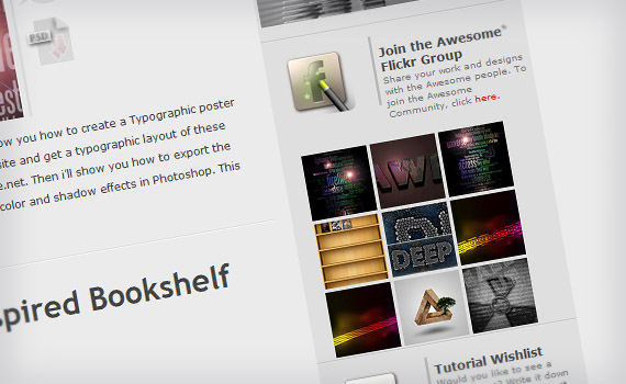
PS Awesome has it’s Flickr group and they’re showing submitted works in their sidebar.
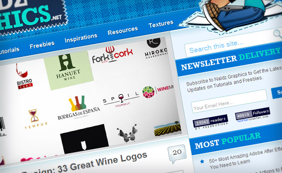
Naldz Graphics offers you to subscribe to their newsletter on the top of sidebar.
Summary
You’ve seen some great, some not so great examples of blog sidebars, so now you can consider – how good is yours. I hope you found something useful in this article and now you’ll be paying more attention to your sidebars. In conclusion I’ve added a screenshot of, what I think, some really awesome sidebars.
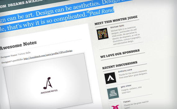
Logo From Dreams sidebars starts with a small info about author. You’ll one (just one) advert then. There’s neat recent comment section with author names and avatars. This is a blog about logos, so there’s a section for popular logos with small thumbnails. They’re also running logo awards, so there is small section for best logos. Sidebar ends with archive and partners sections. It’s simple, neat and great looking sidebar.
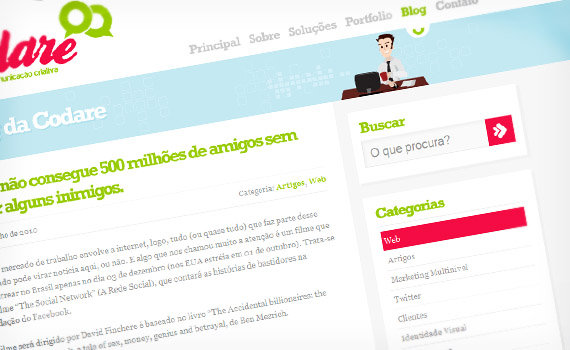
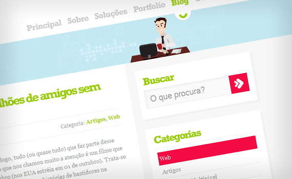
Since this blog is Portuguese most of you won’t find anything useful there, but it has a brilliant and sidebar. Sidebar is customized to match the design and CSS hover effects really add the feeling. Sidebar starts with noticeable search box. Then there’s categories, Twitter updates, archive and tag cloud. Finally photos from Flickr add the missing graphic sense.
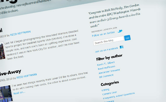
Simplicity has won it today. My third pick, Blue Pixel blog, also has quite simple, yet attractive sidebar. It starts with a quote, then you can see date and time (definitely not even close to GMT though), then there’s two modest links to Twitter and Facebook. Between them you can see the search box. Further sections are very simple, but they have a great contrast within the bold, black title and blue content.
No comments:
Post a Comment